What Is expo-motion-tabs?
expo-motion-tabs is one of the best Expo Router Tab Bars tools for Expo React Native developers. Built by rit3zh, it swaps Expo Router’s default <Tabs> chrome for a morphing popup panel with a shared-element feel, and the repo shows a three-tab example plus a custom popup-body hook. It is built for teams on Expo 55, React Native 0.83, Reanimated 4, and Gesture Handler 2 who want a typed tab bar that looks custom without rewriting navigation.
Quick Overview
| Attribute | Details |
|---|---|
| Type | Expo Router Tab Bars |
| Best For | Expo React Native developers building custom bottom navigation |
| Language/Stack | TypeScript, Expo 55, React Native 0.83, Reanimated 4, Gesture Handler 2, Expo Router |
| License | Unspecified on page |
| GitHub Stars | N/A |
| Pricing | Open-Source |
| Last Release | N/A |
Who Should Use expo-motion-tabs?
- Expo Router app teams building consumer products that need a branded bottom bar instead of the stock footer.
- React Native product engineers who already rely on
expo-routerand want route-aware animation without migrating to a different navigation stack. - Indie hackers shipping MVPs that need a polished mobile shell fast, especially when the tab bar is part of the product identity.
- Design systems teams that want per-tab popup content, custom palette control, and a single place to tune navigation chrome.
Not ideal for:
- Apps that do not use Expo Router
<Tabs>and do not want to restructure navigation just to add a custom footer. - Teams that need a proven Android rollout today, because the project page says Android preview is still TODO.
- Products that only need standard tab navigation and have no need for animated panels or custom bodies.
Key Features of expo-motion-tabs
- Drop-in
tabBarintegration —AnimatedTabBarplugs directly into Expo Router’s<Tabs>API, so the route tree stays intact and only the footer presentation changes. You can keepscreenOptions, labels, and icons exactly where Expo Router expects them. - Morphing popup panel — each tab can open a dedicated popup panel with a shared-element feel, which makes the bar behave more like a contextual surface than a static footer. That is the main reason expo-motion-tabs stands out from plain bottom bars.
- Custom popup bodies —
renderPopupBodyreceives anIPopupRenderContext, so you can branch onactiveViewand return different React trees per route. This is useful for home dashboards, search filters, profile actions, or any tab-specific utility panel. - Themeable palette and surfaces — the component exposes color and body customization instead of locking you into a fixed design token set. That matters when you need dark mode, brand colors, or a per-screen visual language.
- TypeScript-ready API — the repo and usage examples are typed, which reduces mistakes when wiring popup state or custom renderers. The compiler can catch shape mismatches before you ship the component into a mobile build.
- Expo animation stack compatibility — the project is built around Reanimated 4 and Gesture Handler 2, which are the standard primitives for managed Expo motion work. That keeps the implementation aligned with the same runtime most Expo apps already use.
- Source-first customization — the repository is meant to be cloned and modified locally, which is a good fit when you want to fork the UI rather than depend on a black-box package. For teams with strong design requirements, that is often easier than waiting on a package release cycle.
expo-motion-tabs vs Alternatives
If you're comparing adjacent UI primitives, browse all React Native UI tools or Expo Router tools. expo-motion-tabs sits in a smaller lane than full navigation frameworks, so the meaningful comparison is against opinionated tab systems rather than entire app routers.
| Tool | Best For | Key Differentiator | Pricing |
|---|---|---|---|
| expo-motion-tabs | Expo Router apps that need animated bottom tabs | Morphing popup panel with custom body rendering | Open-Source |
| React Navigation Bottom Tabs | Apps needing a full navigation ecosystem | Mature navigator stack and broad ecosystem support | Open-Source |
| Expo Router default Tabs | Simple tab navigation with minimal customization | Built-in router tabs with almost no extra UI logic | Free |
| react-native-tab-view | Pager-style tab interfaces and swipeable screens | Focused on tab views and gestures rather than bottom navigation chrome | Open-Source |
Pick React Navigation Bottom Tabs when you need a full navigation toolkit and do not care about a custom animated footer. It is the safer option for teams that want a well-known navigator model instead of a specialized visual component.
Pick Expo Router default Tabs when you want the least possible surface area and your UI does not need a morphing popup panel. It is the better choice for internal tools, basic apps, or teams that would rather keep navigation plain.
Pick react-native-tab-view when your interface is really a page container with horizontal gestures, not a bottom nav replacement. It fits dashboards and paged content better than an animated footer with contextual panel actions.
How expo-motion-tabs Works
expo-motion-tabs works by sitting inside Expo Router’s tabBar hook instead of replacing the router itself. Expo Router still owns route state, descriptors, and navigation events, while expo-motion-tabs renders a custom shell that translates the active tab into an animated popup presentation.
The design choice here is separation of concerns. Routing stays in Expo Router, visual motion lives in the tab bar component, and tab-specific content comes from renderPopupBody, which means you can swap panel bodies without changing screen registration.
<Tabs
  screenOptions={{ headerShown: false, tabBarStyle: { height: 0 } }}
  tabBar={(props) => (
    <AnimatedTabBar {...props} renderPopupBody={MyPopupBody} />
  )}
>
That snippet hides the stock footer and inserts the animated tab bar in its place. When a tab changes, expo-motion-tabs can animate the popup surface, update the active body, and keep the route tree stable so navigation remains predictable.
The motion stack matters because it is built on Reanimated and Gesture Handler rather than a bespoke animation system. That gives expo-motion-tabs the same runtime characteristics as other modern Expo motion components, which is useful when you want predictable frame behavior and a familiar debugging path.
Pros and Cons of expo-motion-tabs
Pros:
- Keeps Expo Router’s route model intact, so you do not have to rebuild app navigation to get a custom footer.
- Adds a distinctive animated UI layer that feels product-specific instead of generic.
- Supports custom popup bodies per tab, which is useful for contextual controls and screen-specific panels.
- Uses TypeScript-friendly types, which makes refactors and tab-body wiring less error-prone.
- Aligns with the standard Expo motion stack, which reduces the number of new primitives your team has to learn.
- The repository is source-first, so experienced teams can fork and tune the implementation quickly.
Cons:
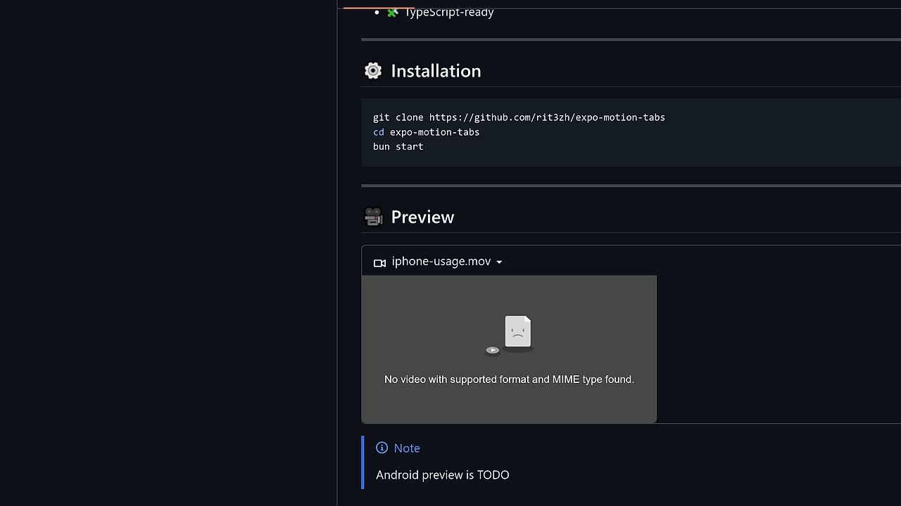
- The project page says Android preview is still TODO, so cross-platform confidence is not complete from the public docs alone.
- The page shows a clone-and-run workflow rather than a published package install, which is less convenient for direct dependency management.
- It only makes sense if your app is already on Expo Router
<Tabs>; otherwise the integration cost outweighs the benefit. - Custom popup bodies mean more UI state to own, which is extra work compared with a standard static tab bar.
- Documentation is lightweight, so production teams will need to read the source to understand extension points.
Getting Started with expo-motion-tabs
A local checkout is the fastest way to try expo-motion-tabs. The repo’s own commands start from source, which is consistent with a component you may want to fork or embed into an existing Expo Router app.
git clone https://github.com/rit3zh/expo-motion-tabs
cd expo-motion-tabs
bun install
bun start
That flow should boot the example project and show the animated tab bar preview. If you wire expo-motion-tabs into your own app, you may also need the @/ path alias used in the usage sample so imports like @/motion-tabs resolve correctly.
The first thing to verify after launch is that your tab bar height is set to zero in screenOptions and that your custom popup renderer is receiving the active tab name. After that, you can replace the example panel with route-specific content and tune palette values to match your app theme.
Verdict
expo-motion-tabs is the strongest option for Expo Router apps that need a branded bottom-tab experience and can accept a source-first component. Its biggest strength is the morphing popup panel with a drop-in tabBar API; the caveat is that Android is not fully documented yet and the project page is still sparse. I would use it for product UIs, not generic navigation boilerplate.